I know. And reason didn't change. More handy is all of them on one screen but this demand also scrolling implementation and scroll visible element. Quite a lot of work.
Argument about noobie users is not valid because almost all those options is black magic for them. They simple need to learn that some stuff they do not touching if not understanding (on all consoles, pc or mobile devices). That's the main reason why commercial software is completely castrated from most possible options in GUI. But this is scene, and creating buffer (the guardian) between commercial world and scene users leading to limiting them and/or functionality. In this specific case, it is no big deal anyway, I just point that the way how it looks like could be better and newbie users doesn't even care.
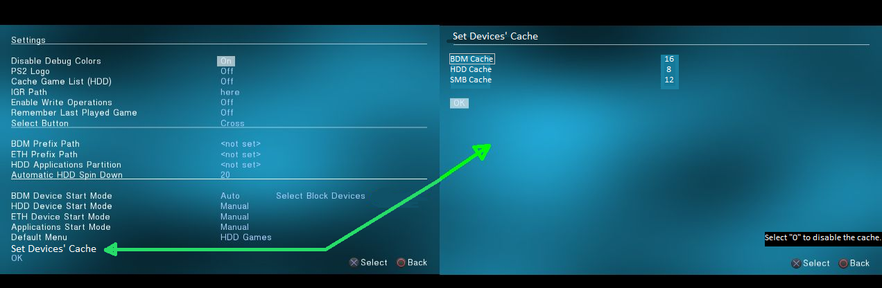
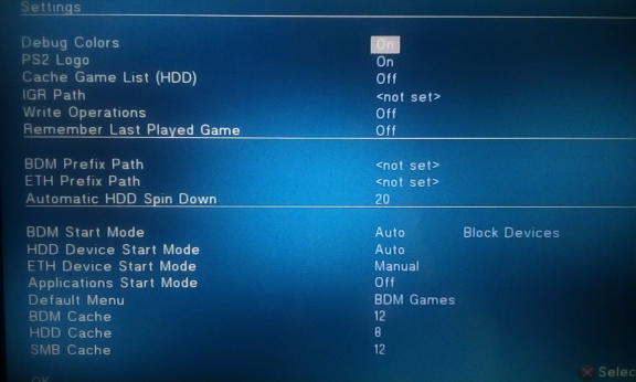
Why sub menus? Categories are separated by underline. Or didn't I understood something?

 Continue your great work devs!
") And if someone have such attitude from second sentence, well, mr. Darwin have something to say about that.
And if someone have such attitude from second sentence, well, mr. Darwin have something to say about that.  What do these caches do? Is it a ram based cache?